S.P. Urban 49 — Brand Identity
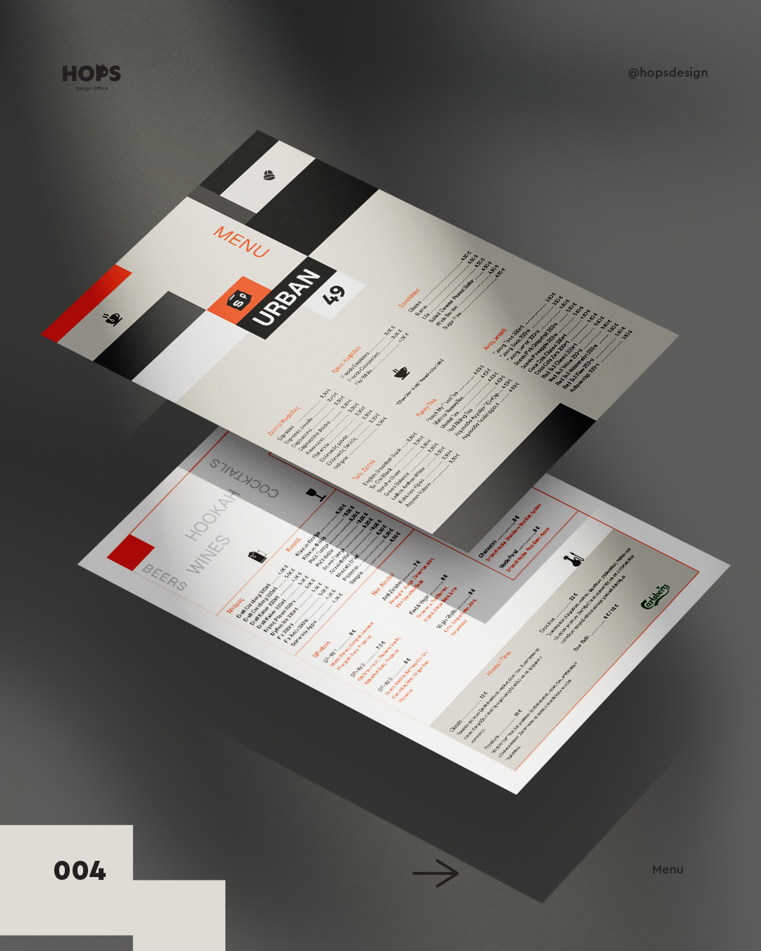
The Brief S.P. Urban 49 is a modern urban spot combining food, drinks, and shisha in a relaxed, contemporary setting. The client needed a brand identity that felt bold and versatile — strong enough to anchor a physical space, flexible enough to live across apparel, print, and digital.
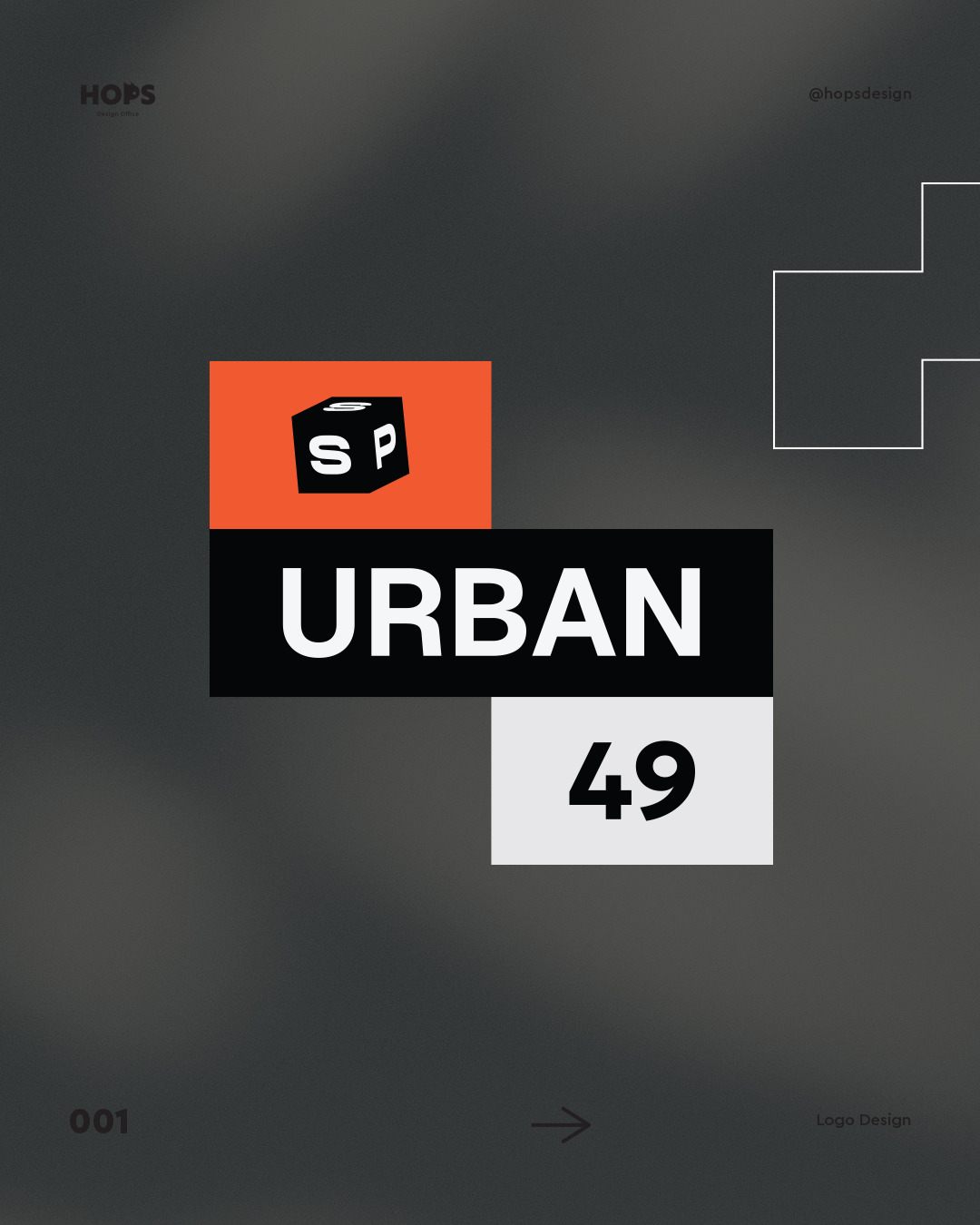
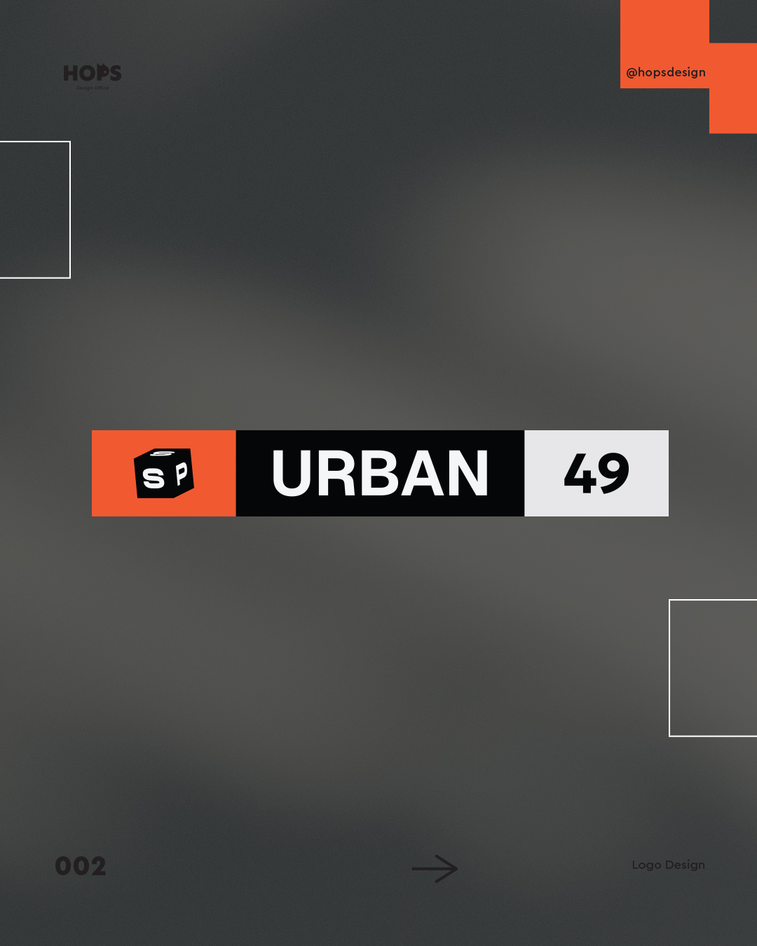
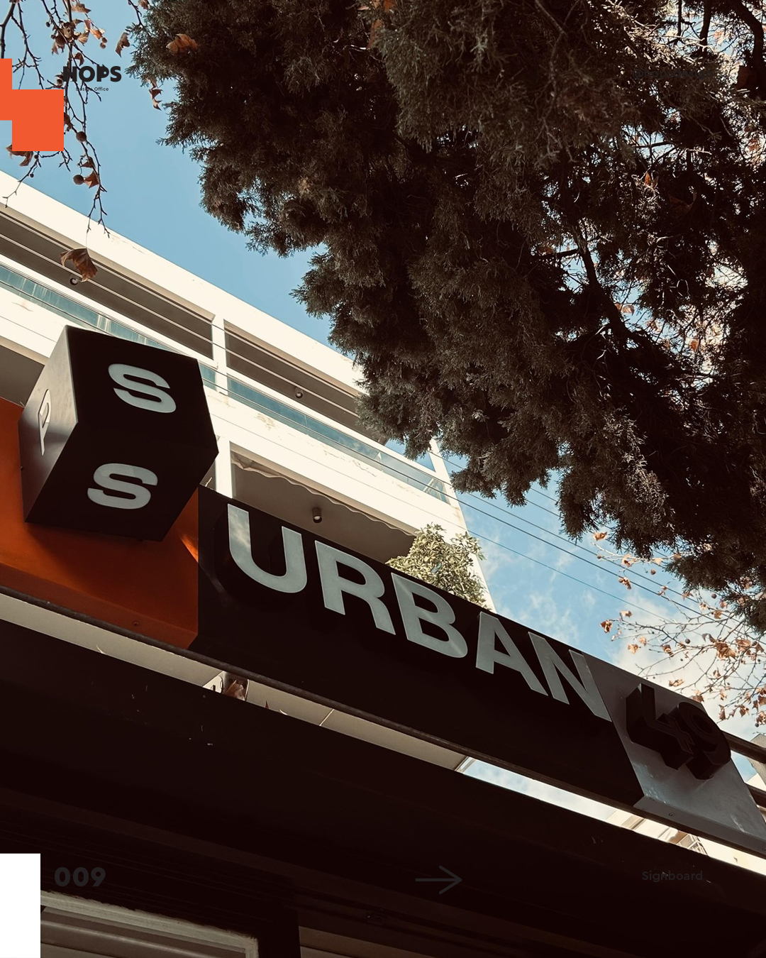
The Challenge The logo had to incorporate two distinct elements — a dice and the number 49 — without creating visual confusion. It also needed to work across both vertical and horizontal formats, from storefronts to Instagram posts to t-shirts.
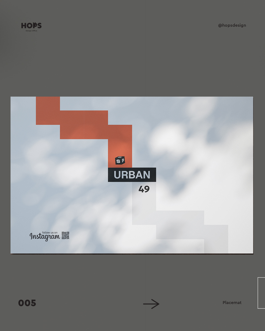
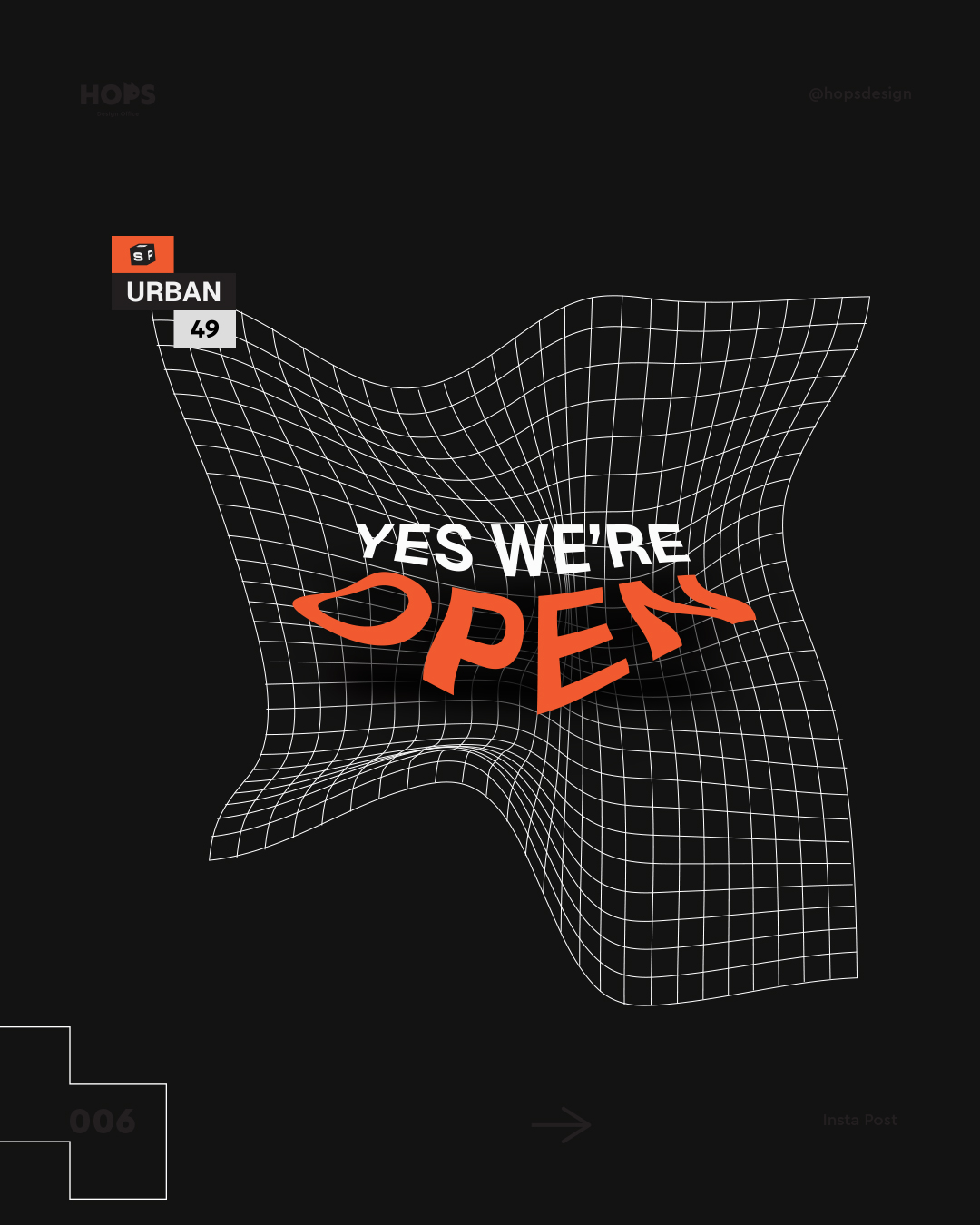
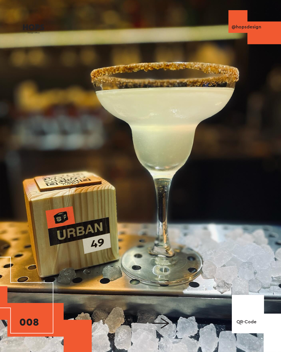
The Process The design direction focused on a modular, geometric system with an urban aesthetic. A restrained color palette of black, white, and orange gave the brand instant visual impact. The hybrid logo was carefully engineered so the dice element and the 49 each hold their own — distinct but unified.
Deliverables
- Logo design & identity system
- Logo animation
- Business card
- T-shirt design
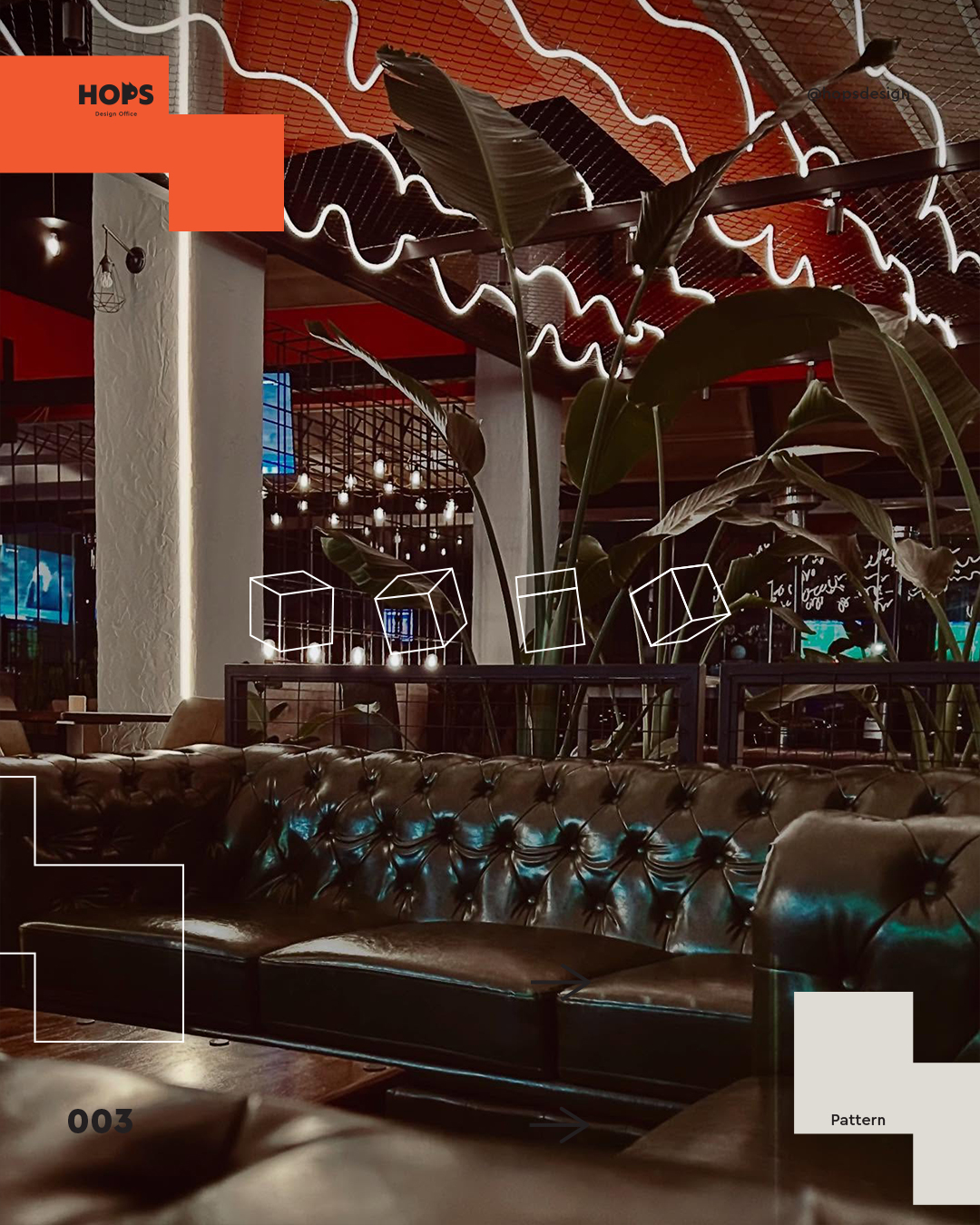
- Poster & social media templates
The Result A flexible brand identity that adapts seamlessly across every touchpoint — giving S.P. Urban 49 a confident, consistent presence whether on a wall, a screen, or a sleeve.